
Brand guidelines · v3 · October 2026
Everything you need
to build like Vremly.
Our logos, colours, typography and motion guidelines. Browse the reference or download it for your AI tools.
01 · Logo
The mark and the letters. One unit.
Use the horizontal logo by default and the V where space is limited. Use the box logo for app icons and avatars, and the emerald V for favicons. Download the artwork rather than recreating it with a font.



The mark
The V for small placements and tight spaces.


Stacked
The vertical logo for square spaces.

Wordmark
Use the wordmark when the V is already on screen.


- Clear space: keep a quarter of the logo's height free on every side.
- Use SVG when supported. Transparent PNGs are available at 2400px wide for logos and 1024px for marks.
- Never stretch, outline, rotate, add a shadow or recolour outside these three colourways.
- Never place the white versions on light grounds, or the emerald versions on the emerald gradient.
02 · Colour
Off-white ground, ink type, one emerald.
Use neutral surfaces and subtle borders, with emerald for emphasis. Keep status colours inside product previews and their backgrounds. Select a swatch to copy its value.
Grounds
Ink & text
Accent
App dark theme
Product previews onlyThe app has light and dark themes. This page and the marketing site stay light; their dark bands are painted #0C0C0E. App dark mode uses its own grounds, ink and accents. Preview both themes ↓
On the #121212 app card: primary ink 17.64:1, muted ink 5.79:1, emerald 7.39:1 and gold 9.05:1. These are text pairings, not white labels on solid accent fills.
Product status · light / dark
Same state, two palettesPending
unassigned jobs
Assigned
booked with a technician
In Progress
media capture underway
Uploaded
media handed to editors
Editing
being edited
In Review
quality control before delivery
Delivered
sent to the client
In Revision
changes requested after delivery
Cancelled
cancelled jobs · not a pipeline lane
Status badges use the matching hue as text, a 15% fill and a 30% inset ring. Dark badges on #121212 range from 4.38:1 (Editing, below AA for small text) to 6.77:1. These reproduce the app; they are not a blanket contrast approval for other surfaces.
03 · Type
A sans for headlines, a sans for reading, one serif word.
Use IBM Plex Sans Bold for headlines and Inter for body text. Highlight one word with IBM Plex Serif Bold Italic. Use IBM Plex Mono for IDs, values and URLs.
IBM Plex Sans · Bold 700 · Hero
Real estate media, handled.
IBM Plex Sans · Bold 700 · Sections
Three steps. Zero chaos.
Highlight one word per headline in serif italic. Keep the rest in the headline’s sans-serif face.
Inter · 400 · Ledes and body
One platform where agents book media, teams run operations, and providers find work.
Body copy is Inter at 15px with a 1.625 line-height, colour #737373. Hero sub-copy steps up to #525252. Emphasis is semibold ink. Hero buttons are Inter SemiBold 14px on a pill; the nav pill is Medium 13px.
IBM Plex Mono · 11.5px · IDs, values, URLs
app/layout.tsx--font-ibm-plex-sansapp/layout.tsx--font-interapp/layout.tsx--font-ibm-plex-serifapp/brand/fonts.ts--font-ibm-plex-mono04 · The gradient
One emerald texture, in five forms.
The gradients use #059669, #34D399 and #6EE7B7 with lighter and darker shades. Use white text on dark backgrounds and ink on pale ones. Download a finished gradient or the grain layer. Product auroras are reserved for product previews.
#059669 · #34D399 · #6EE7B7 · grain .12radial ellipse at 50% 20% · #FAFAFA 55% → #34D399radial 130% 150% at 50% 20% · #0A0A0A → #059669radial 130% 150% at 50% 20% · #FAFAFA → #059669linear 135° · #059669 → #34D399 → #6EE7B7feTurbulence .65 · 3 octaves · multiply- Sizes: wide 2400×1500, tall 1200×2400 for phones, square 1600×1600. The three radial SVGs scale to any box; the fallback SVG is exact at 16:10.
- In code: the parent is
position: relative; overflow: hidden, the texture is absoluteinset: 0, and content sits above it atz-index: 10. - One live grainient per view. It pauses off-screen and draws a single still frame under reduced motion.
- Never place the emerald logo on any of these. Body type is white on the dark and grainy forms and ink on the pale ones. The page grain never goes above 2%.
The product aurora
A second surface, and it belongs to the product.bg-blue-100 · 4 blobs · soft-light · grain .08bg-violet-100 · 4 blobs · soft-light · grain .08bg-emerald-100 · 4 blobs · soft-light · grain .08- Each pipeline status has its own colourway, using the colours in section 02. Match the background to the status shown in the product preview.
- Product art only: a project card, a job-sheet header, a sidebar notification card, and the replicas of those on this site. Never a marketing band, and never behind marketing type.
- No file to download: each surface is generated from its status and a seed, so the same card is drawn the same way every time. Place
AuroraGradient, never a screenshot of one. - These backgrounds come from the app. Keep the website version in sync when the app changes.
05 · The mark
Two strokes and a slit. The V is never redrawn.
Use the box logo for app icons and avatars. The notched V belongs to Vremly Scan. Download the supplied files instead of redrawing either mark.



- A solid left stroke, then a thin stripe that turns into the right arm. The slit between them is what makes the V Vremly's.
- The stripe is 3.3% as wide as the mark is tall, so it falls under a pixel below about 30px. The V still reads there; for favicons, use the box logo.
- In the horizontal logo the mark is the V of VREMLY. In the wordmark the V is a plain letter. Never swap one for the other.
- The V with nine ruler marks on its left stroke belongs to Vremly Scan. Use the plain V for Vremly.
06 · Components
Pills, windows, cards. Used as-is.
Use solid ink pills for primary actions and white pills for secondary actions. The examples use the site’s component styles. Put product previews in app windows and longer text on a white surface.
Buttons
Button card · phone menu
Chips
Window
Project card · the app’s layout, with illustrative account data.
Dark pill
01
Agent books
A slot is only offered if someone can actually serve that package.
Dark card showing one step in a job
Vremly is built and run by a working real-estate media company.
 Vremly
07 · Dashboards & consoles
Product lives in windows. Claude reads it in the console.
Build product graphics with the light or dark app window below. Use neutral chrome and the product’s status colours. The console shows Claude reading a Vremly account through the MCP connector. Writes require your permission.
Dashboard · overview excerpt
Further down · Active Projects excerpt · after Schedule and Live Project Map
Illustrative account. The toggle changes these product excerpts only.
Prompt: Which of my invoices are still unpaid?
- vremly_search_endpoints "invoices"
- vremly_describe_endpoint GET /invoices
- vremly_request GET /invoices?status=SENT&status=OVERDUE
- Customer: Marc Lefebvre, Amount: CA$612.15, Overdue: 21 days
- Customer: Priya Sandhu, Amount: CA$389.00, Overdue: 9 days
- Customer: Daniel Okafor, Amount: CA$489.00, Overdue: not yet due
- Total: CA$1,490.15
Read only · nothing changed
08 · Motion
Replicas loop in windows. Sections rise once.
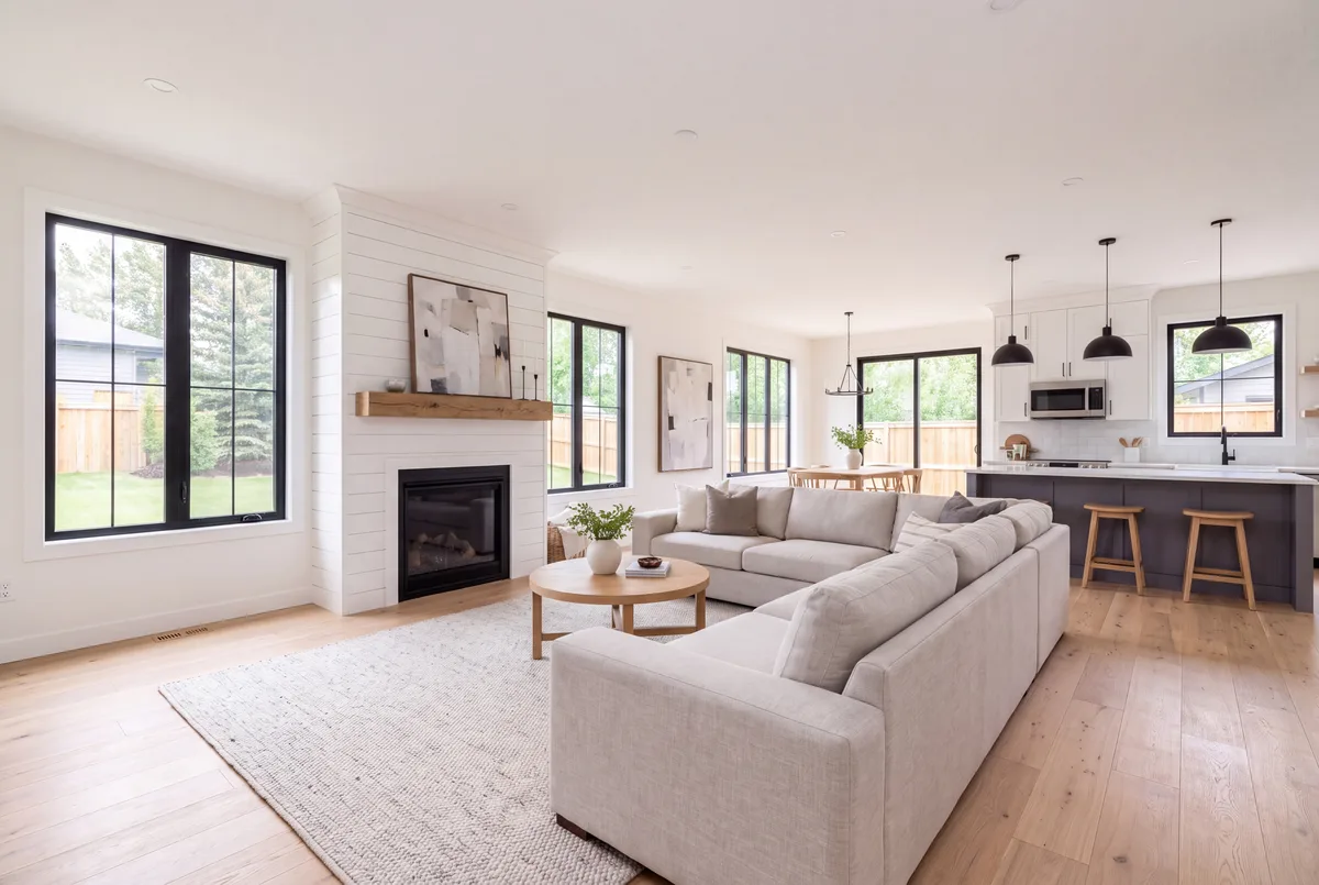
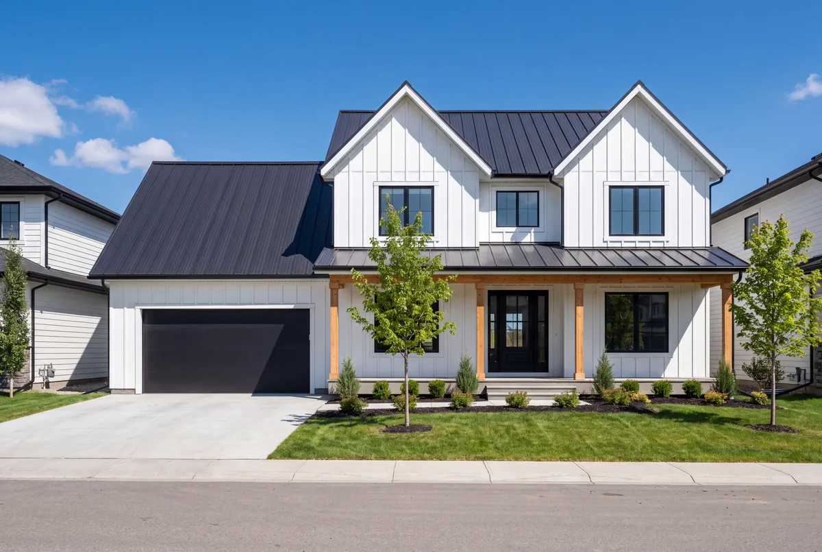
Entrances play once, as a section arrives. Product replicas loop through their steps only while they are on screen. The timings below are read from the site's code. This is a live replica from the home page, running.


































useLoop9.6scubic-bezier(0.25, 0.4, 0.25, 1); the hero's badge, buttons and frame, and the header, on (0.25, 0.46, 0.45, 0.94). Under reduced motion, replicas pin their last step, the accent word and marquees freeze, and the grainient draws one frame.—09 · For AI
The brand LLM file.
A Markdown file with our tokens, fonts, logos, gradients, component styles, motion timings and copy rules. Give it to your AI tools when building a Vremly page.
https://vremly.com/vremly-brand.md